Advanced Search
User-centered iteration to increase feature usage.
The Problem
Finding relevant search results is challenging for our agents because they are unaware which data set (public record or listing) is being searched and are not familiar with the filters we support.
My Role
My Role
As the design lead for this initiative, I spearheaded the evaluation of our Advanced Search feature after noticing low engagement metrics. To uncover the root causes, I organized and facilitated user interviews, which revealed three key areas for improvement. Collaborating closely with the Product team, I guided my design team in developing solutions that addressed these insights, ensuring alignment across both consumer and enterprise experiences.
Current challenges
Current challenges
We heard the following challenges:
• Agents are confused by the separate map + search experience
• Remine is lacking commonly used fields
• Agents often compare Remine to their MLS and are unsure why the result count is different
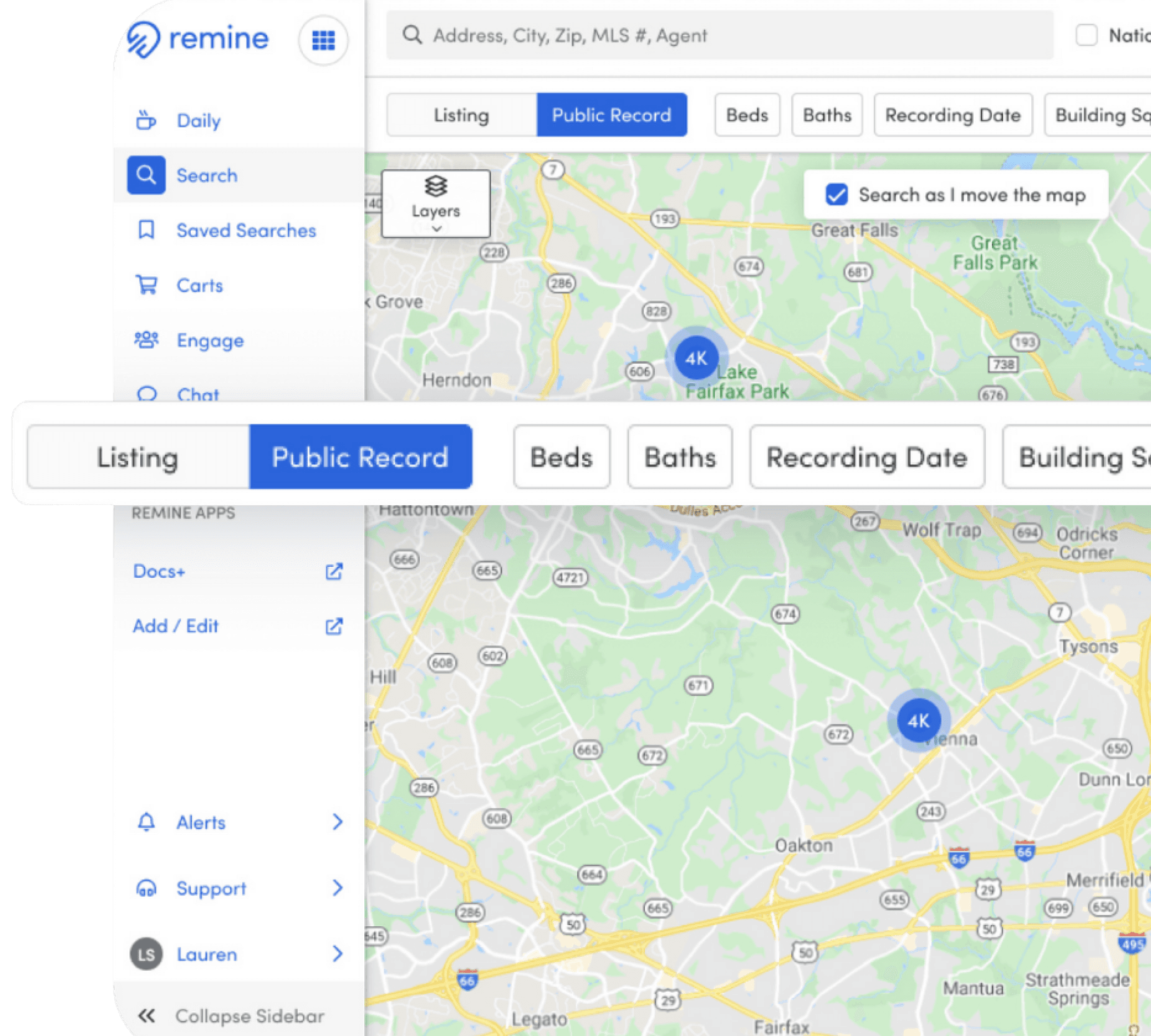
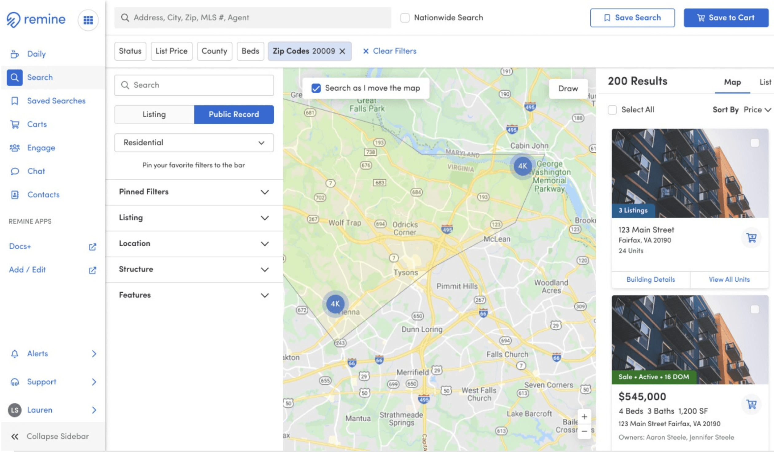
Existing screens
DESIGN EXPLORATIONS
SEARCH CONCEPTS
How might we provide a clear distinction between Public Record and Listings Search and enable users to switch between them?
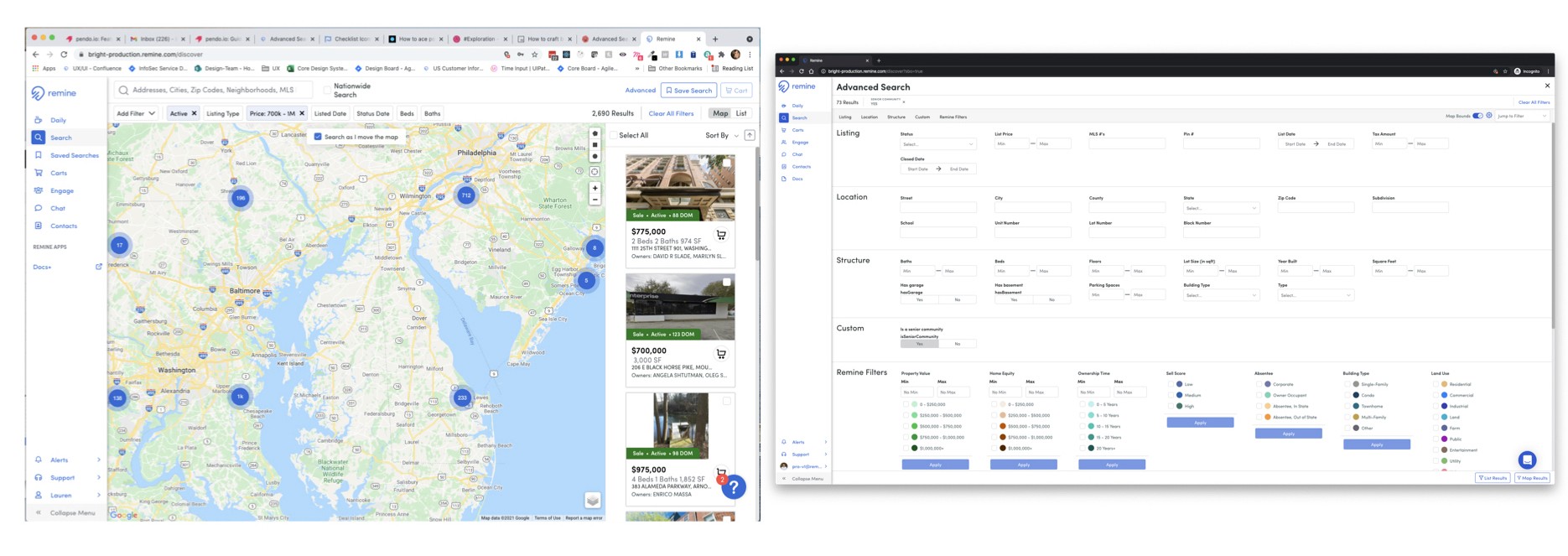
Concept 1
PRIMARILY LISTING
Prioritized listing search by placing Public Record search in secondary drop down menu.
Prioritized listing search by placing Public Record search in secondary drop down menu.
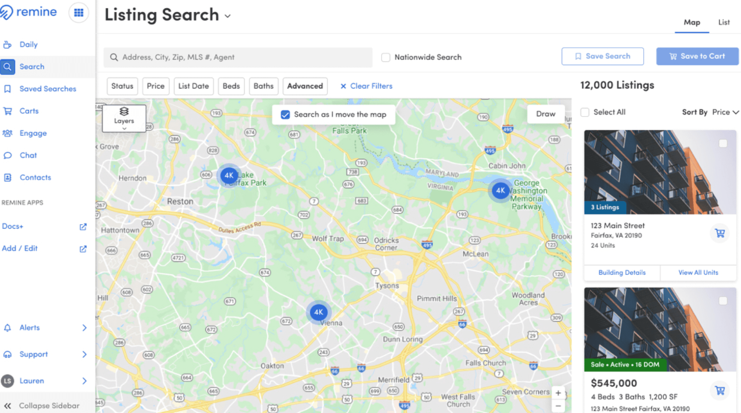
Concept 2
TOGGLED SEARCH
Placed Listing and Public Record (PRD) toggle in prominent position to bring greater visibility to listing and public record search options.
Placed Listing and Public Record (PRD) toggle in prominent position to bring greater visibility to listing and public record search options.
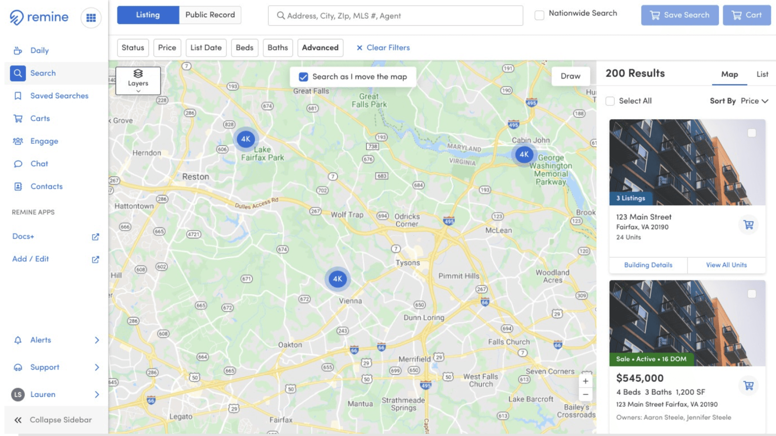
Concept 3
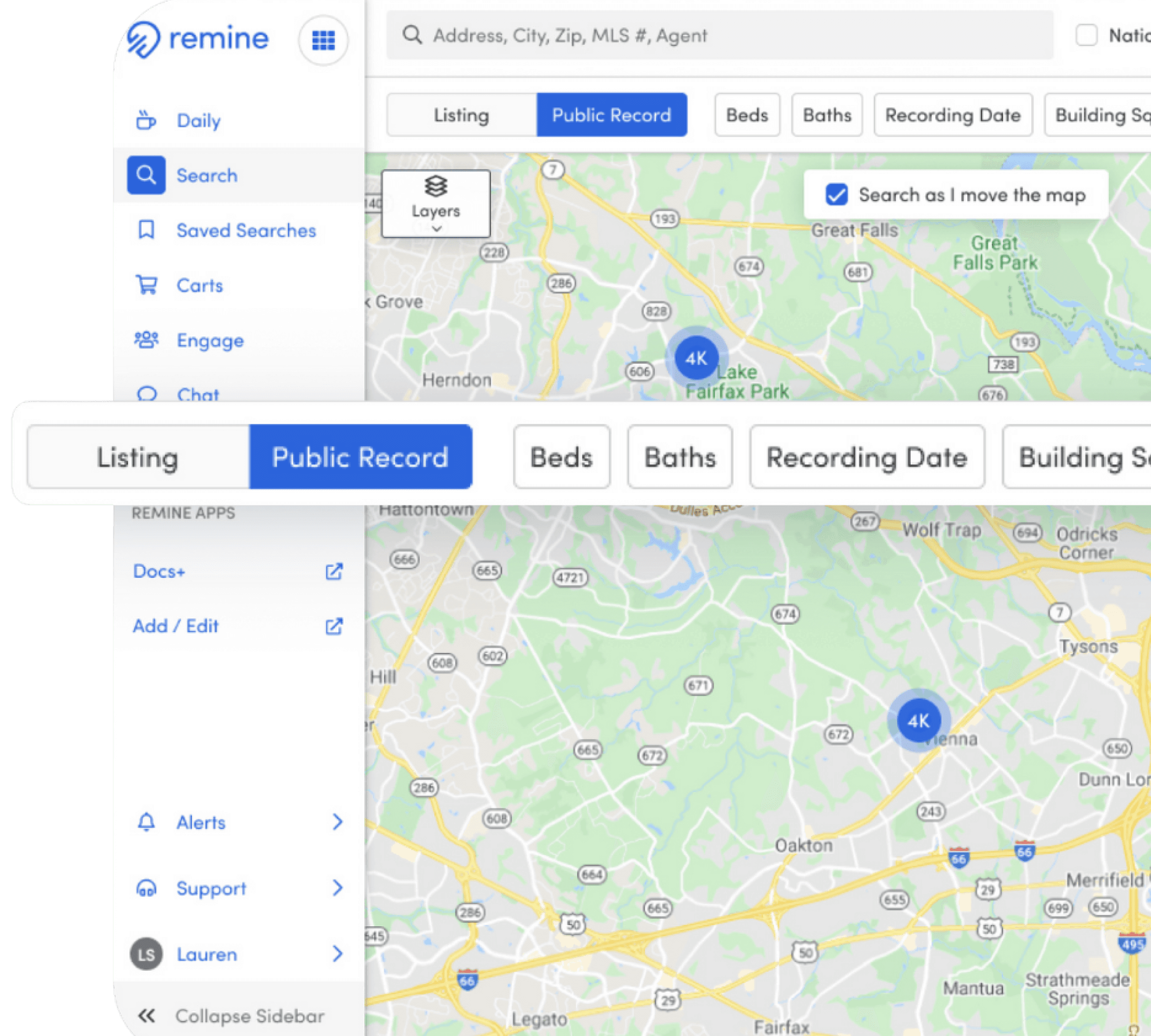
FILTER FINDER
Provided combined search toggle plus advanced search functionality.
Usability Testing
Usability Testing
I led the team through usability testing by setting strategic direction on participant selection, testing scripts, and key focus areas.
Results
36%
Participants who successfully navigated to the filter finder to apply a filter
84%
Participants that rated the filter experience as intuitive
81%
Participants that correctly navigated to find the List view for results
51%
Participants who successfully located the Listing / Public Record toggle
06%
Participants who were able to apply advanced logic to their query
Key Takeaways
The filter finder sidebar is intuitive for our users to navigate.
The filter types, Public Record and Listing are too buried in the filter finder
We need further testing of the advanced logic feature
Users can navigate successfully between the list and map view of results.
Next Steps
The team revisited the advanced search toggle location and advanced logic controls due to poor performance and gathered feedback via an unmoderated test
Iterations & Results
The team iterated on the filter bar and advanced logic features and subsequently ran an unmoderated study.
Improved Filter Bar
Approach
Updated approach placed Listing and PRD control more prominently, allowing users to toggle between data sets.
Results
20%
Increase of discoverability for the Listing/PRD toggle with new placement
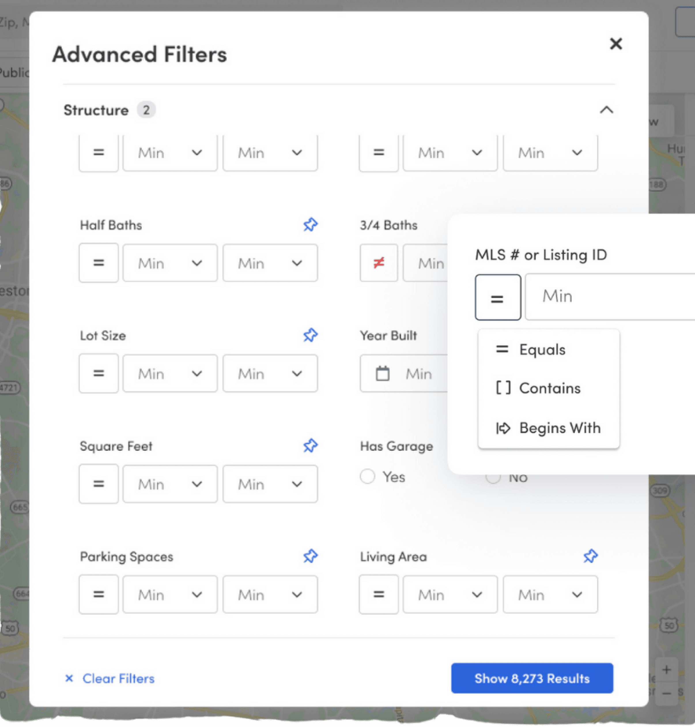
Advanced Search Modal
Approach
The original concept placed filters in a panel with accordions in which a user could explore sections to discover the desired filters. Since only 36% of participants successfully interacted with the filter finder, the team updated layout to a modal to allow users to interact more easily.
Results
19S
Seconds decrease to apply filters compared to original full page experience
reflection
There is more than one solution to a problem, you just need to uncover the best solution given the constraints.
Defend the process to stakeholders to enable the team to do their best work
additional Case Studies
additional Case Studies
Deposit Account Opening
Blend,
March 2024
I spearheaded a collaborative overhaul of Blend's deposit account opening product for enhanced efficiency and user experience that led to an 89% increase in funding conversion.
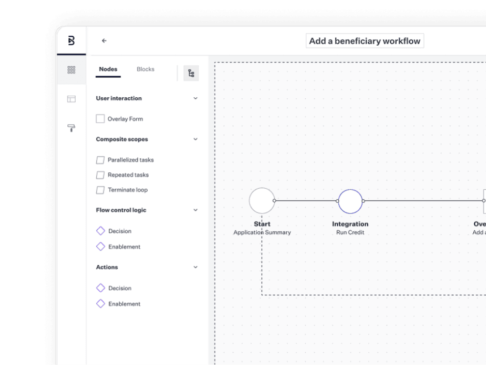
The Creation of Subworkflows
Blend,
June 2024
A complex, cross-functional case study showing how I led design efforts to drive meaningful change across multiple business lines—improving the consumer experience and evolving Blend’s configurable platform.
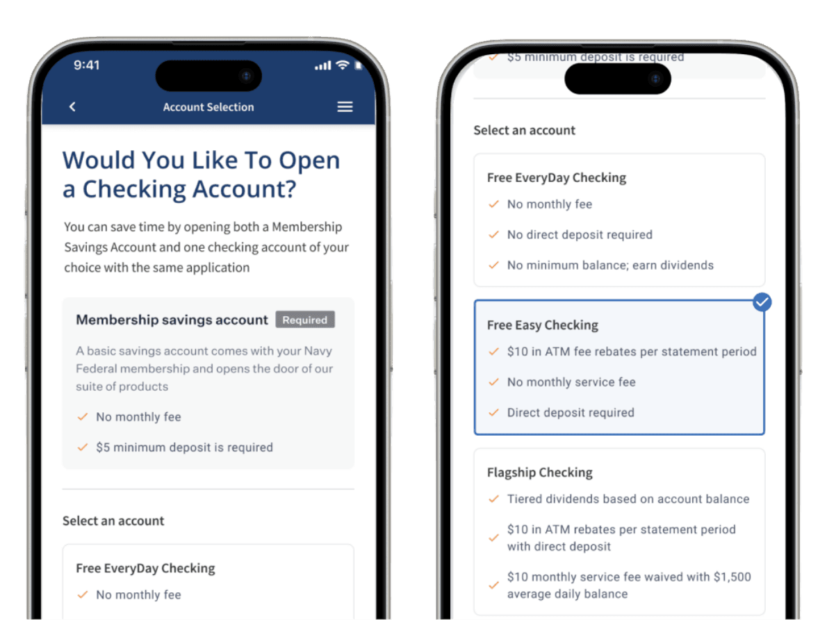
Product Account Selection
Blend,
January 2025
I designed an iterative improvement the account selection flow that led to an increase accounts booked per application.
The Problem
Finding relevant search results is challenging for our agents because they are unaware which data set (public record or listing) is being searched and are not familiar with the filters we support.
My Role
While reviewing product engagement, we identified low usage for our Advanced Search feature. To better understand why this was happening, we met with users to discuss the feature. The outcome of the meeting identified 3 key areas of improvement. From there, my team worked with Product to design solutions
Current challenges
We heard the following challenges:
Agents are confused by the separate map + search experience
Remine is lacking commonly used fields
Agents often compare Remine to their MLS and are unsure why the result count is different
Existing screens
DESIGN EXPLORATIONS
SEARCH CONCEPTS
Provide a clear distinction between Public Record and Listings Search, but enable users to switch between them
Concept 1
PRIMARILY LISTING
Prioritized listing search by placing Public Record search in secondary drop down menu.
Concept 2
TOGGLED SEARCH
Placed Listing and Public Record (PRD) toggle in prominent position to bring greater visibility to listing and public record search options.
Concept 3
FILTER FINDER
Provided combined search toggle plus advanced search functionality.
Usability Testing
Led the team through usability testing by setting strategic direction on participant selection, testing scripts, and key focus areas.
Results
36%
Participants who successfully navigated to the filter finder to apply a filter
84%
Participants that rated the filter experience as intuitive
81%
Participants that correctly navigated to find the List view for results
51%
Participants who successfully located the Listing / Public Record toggle
06%
Participants who were able to apply advanced logic to their query
Key Takeaways
The filter finder sidebar is intuitive for our users to navigate.
The filter types, Public Record and Listing are too buried in the filter finder
We need further testing of the advanced logic feature
Users can navigate successfully between the list and map view of results.
Next Steps
The team revisited the advanced search toggle location and advanced logic controls due to poor performance and gathered feedback via an unmoderated test
Iterations & Results
The team iterated on the filter bar and advanced logic features and subsequently ran an unmoderated study.
Improved Filter Bar
Approach
Updated approach placed Listing and PRD control more prominently, allowing users to toggle between data sets.
Results
20%
Increase of discoverability for the Listing/PRD toggle with new placement
Advanced Search Modal
Approach
The original concept placed filters in a panel with accordions in which a user could explore sections to discover the desired filters. Since only 36% of participants successfully interacted with the filter finder, the team updated layout to a modal to allow users to interact more easily.
Results
19S
Decrease in time it takes to apply filters compared to original full page experience
reflection
There is more than one solution to a problem, you just need to uncover the best solution given the constraints.
Defend the process to stakeholders to enable the team to do their best work