Account selection
Improve account selection clarity, with minimal engineering effort, to encourage more users to open an additional checking account.
The Problem
The recently-launched account selection page had 3% dropoff, which resulted in significant revenue lost for a customer.
my role
I led the design efforts for this project by aligning cross-functional partners to identify a technically feasible solution with a quick turnaround. My role included designing the solution while collaborating closely with Product, Engineering, and other stakeholders to ensure the final product met both business goals and technical constraints. Through effective communication and iterative design, I was able to deliver a streamlined experience that met our team's tight deadlines.
Why Now?
A customer's launch with their membership opening led to an immediate 3% increase in drop off on the account selection page, which led to immediate loss of revenue.
Design execution
Improve Interactions
I identified key usability issues that I believed were contributing to user confusion and drop-off.
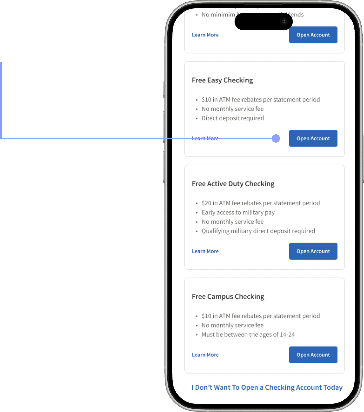
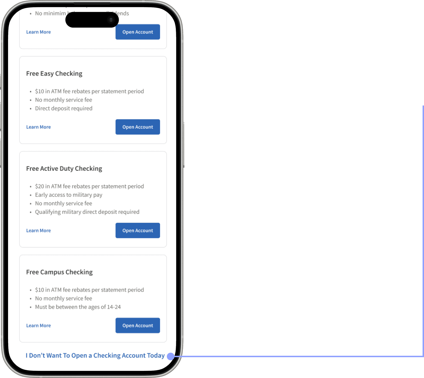
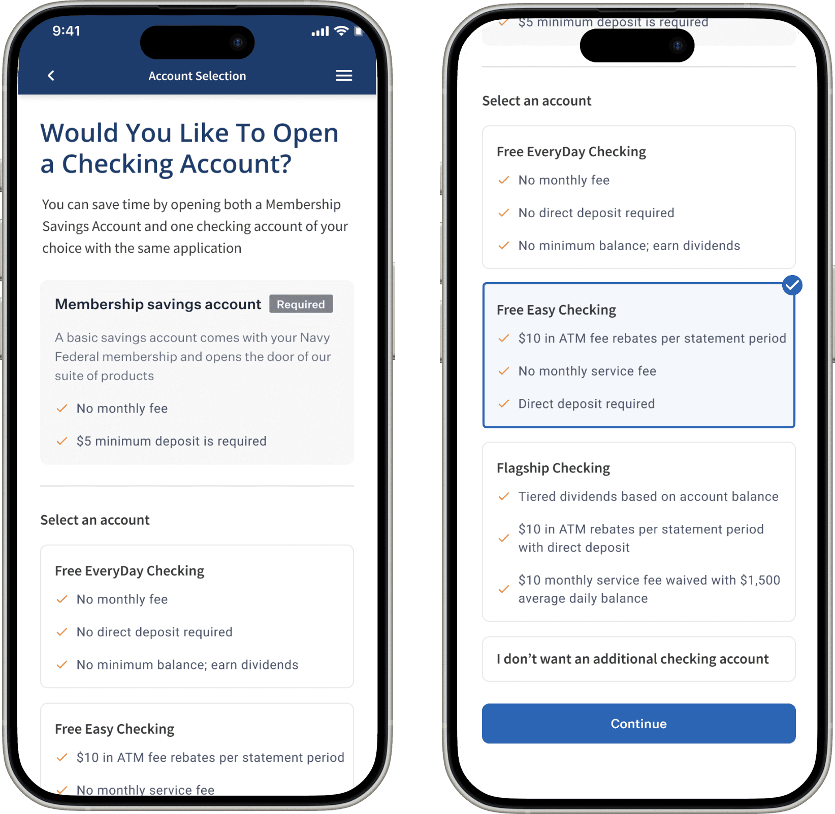
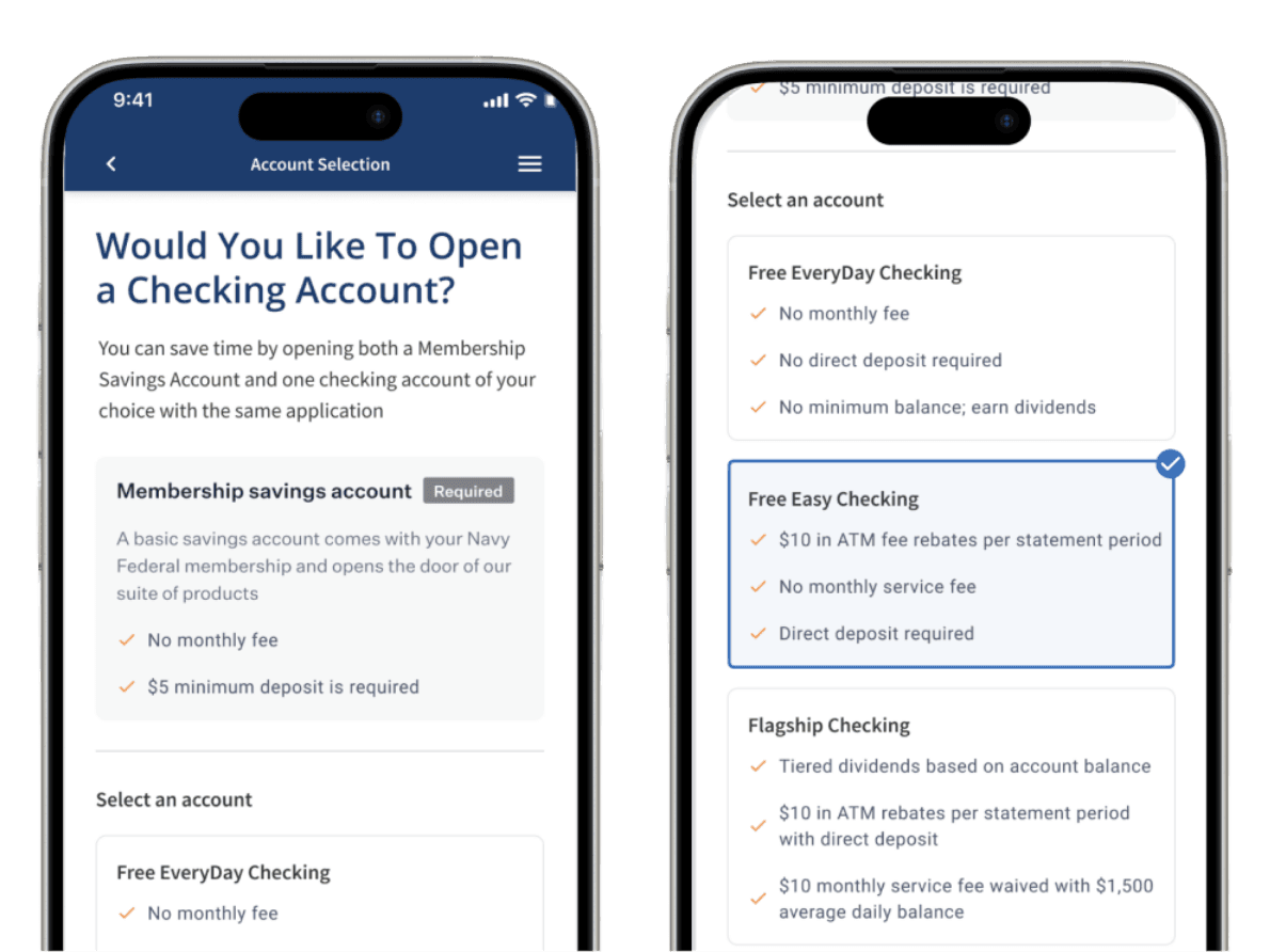
Users had to click "Open Account" to select an option.
Unclear Interaction
Confusing CTA Placement
I don’t want to open a checking account” was in the primary CTA position, discouraging engagement.
Confusing CTA Placement
I don’t want to open a checking account” was in the primary CTA position, discouraging engagement.
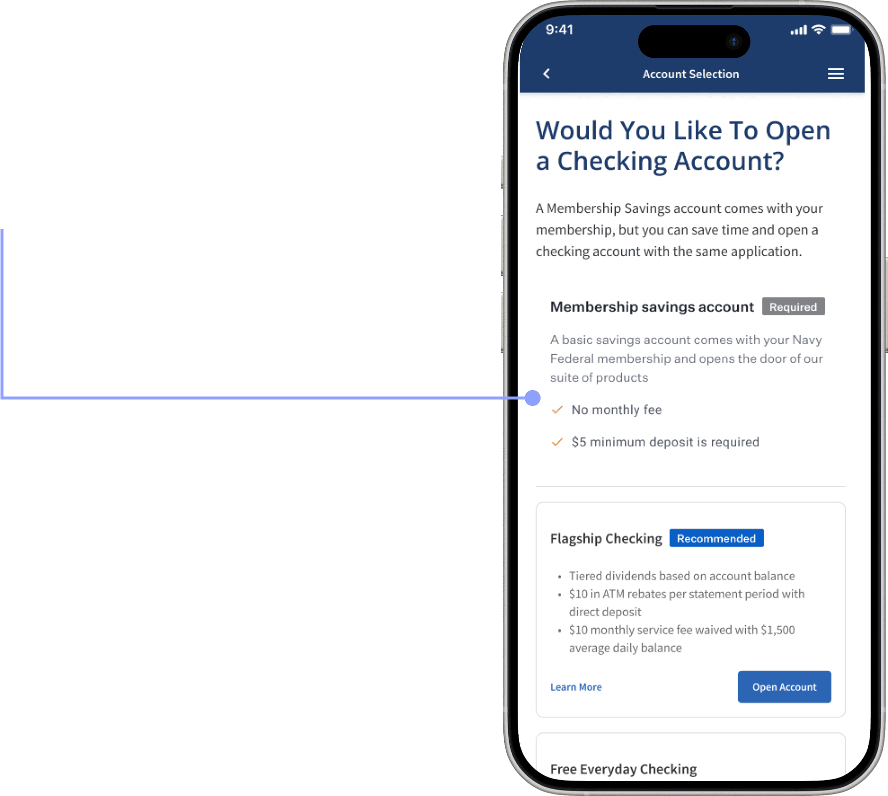
The Membership Savings Account was visually different from the other options, making it unclear that it was an account selection.
Inconsistent Styling
Proposed improvements
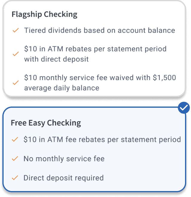
Visual Consistency: Aligned the styling of the Membership Savings Account with other account options to improve clarity and reduce cognitive load.
Intuitive Selection Flow: Shifted the interaction model to allow users to select an account first, then proceed—making the experience more natural and aligned with user expectations.
Improved CTA Hierarchy: Reframed “I don’t want an additional account” as a selectable option rather than a primary button, minimizing distraction and encouraging deeper engagement.
Results
4%
increase in users choosing an additional checking account within 48 hours.
Why it worked
A more intuitive selection process led to higher engagement.
Improved visual hierarchy reduced confusion.
Less friction meant users were less likely to opt out prematurely.
A more intuitive selection process led to higher engagement.
Improved visual hierarchy reduced confusion.
Less friction meant users were less likely to opt out prematurely.
Reflection
This project was a valuable reminder that meaningful impact doesn’t always require a massive overhaul. Even within the constraints of a small, fast-moving initiative, we uncovered real friction points and made thoughtful changes that improved the user experience. It reinforced my belief that growth often happens in the micro-moments: asking the right questions, aligning the right people, and pushing for clarity in the details.
additional Case Studies
additional Case Studies
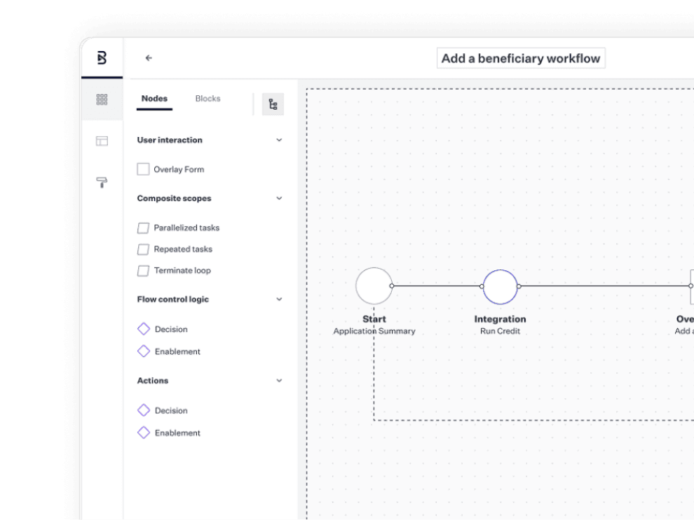
The Creation of Subworkflows
Blend,
June 2024
A complex, cross-functional case study showing how I led design efforts to drive meaningful change across multiple business lines—improving the consumer experience and evolving Blend’s configurable platform.
Product Account Selection
Blend,
January 2025
I designed an iterative improvement the account selection flow that led to an increase accounts booked per application.
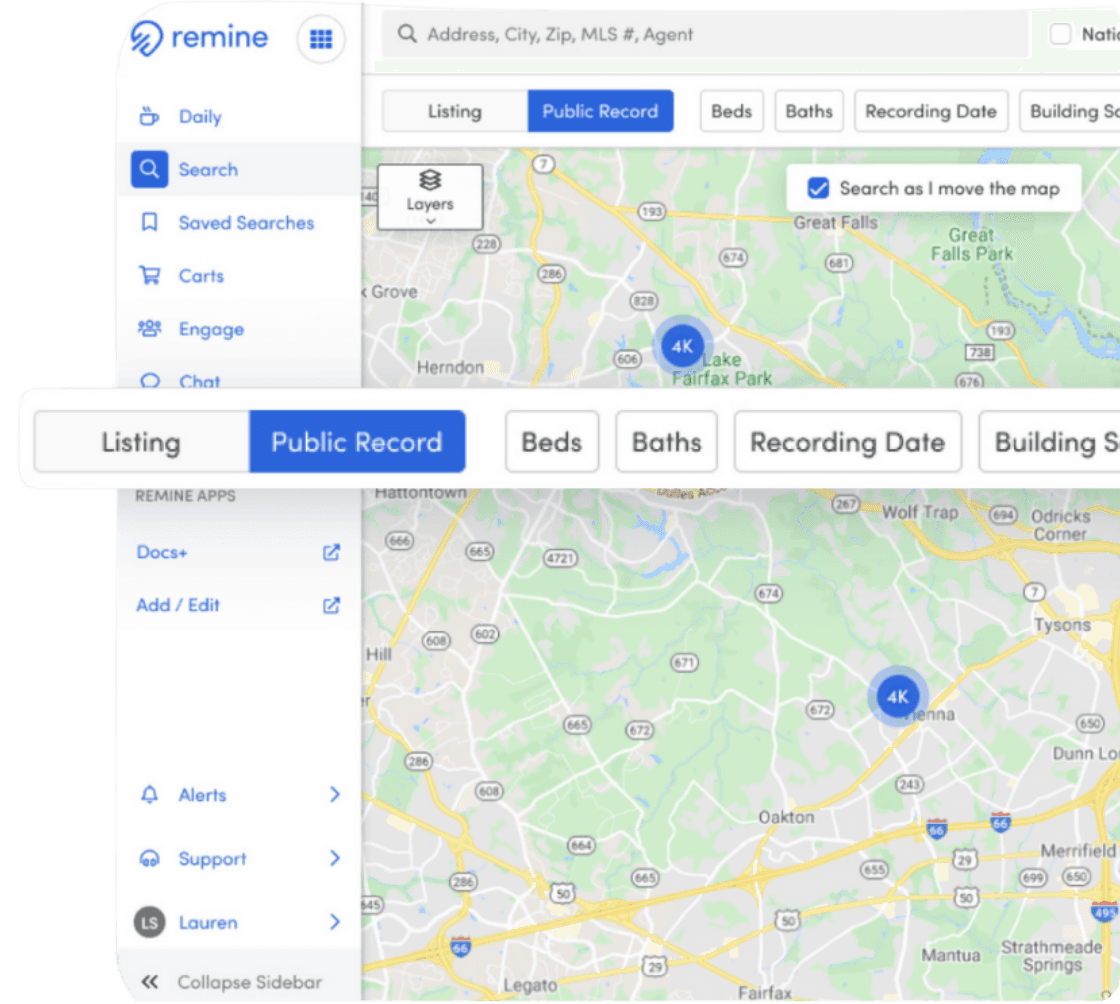
Advanced Search
Remine,
September 2021
Led feature enhancements empowering real estate agents to selectively search public records or listing data with improved visibility into the dataset being queried.
The Problem
The recently-launched account selection page had 3% dropoff, which resulted in significant revenue lost for a customer.
My Role
I led the design efforts for this project by aligning cross-functional partners to identify a technically feasible solution with a quick turnaround. My role included designing the solution while collaborating closely with Product, Engineering, and other stakeholders to ensure the final product met both business goals and technical constraints. Through effective communication and iterative design, I was able to deliver a streamlined experience that met our team's tight deadlines.
Why now?
A customer went live with their membership opening product, but unfortunately saw an immediate 3% increase in dropoff on the account selection page.
Design execution
1
Improve Interactions
To guide our design improvements, I began by identifying key usability issues that I believed were contributing to user confusion and drop-off.
Users had to click "Open Account" to select an option.
Unclear Interaction
I don’t want to open a checking account” was in the primary CTA position, discouraging engagement.
Confusing CTA Placement
The Membership Savings Account was visually different from the other options, making it unclear that it was an account selection.
Inconsistent Styling
Proposed improvements
Consistent Design: Styled Membership Savings Account to match other options for clarity.
Selection-Based Interaction: Users now select an account first, then continue
Better CTA Hierarchy: Changed “I don’t want an additional account” from a CTA button to a selection option, reducing its prominence.
Results
4%
increase in users choosing an additional checking account within 48 hours.
Why it worked
A more intuitive selection process led to higher engagement.
Improved visual hierarchy reduced confusion.
Less friction meant users were less likely to opt out prematurely.
Reflection
This project was a valuable reminder that meaningful impact doesn’t always require a massive overhaul. Even within the constraints of a small, fast-moving initiative, we uncovered real friction points and made thoughtful changes that improved the user experience. It reinforced my belief that growth often happens in the micro-moments: asking the right questions, aligning the right people, and pushing for clarity in the details.